

 See My Latest Article on HelloNation
Which paint colors are most popular right now?
The most popular paint colors are soft whites, warm neutrals, muted greens, blue-gray tones, and earthy shades that make rooms feel comfortable without becoming visually overwhelming. These colors work well in many homes because they provide flexibility with flooring, furniture, lighting, and changing décor.
Color popularity varies by room and by the amount of natural light available. A shade that looks calm in a bright kitchen may appear darker or cooler in a hallway with limited windows. Paint samples are more reliable than small printed color cards because wall color changes throughout the day.
Why do neutral colors remain so common?
Neutral colors remain popular because they are easy to live with and adapt to many decorating styles. They can make a home feel orderly while allowing wood tones, artwork, textiles, and furnishings to provide contrast.
Common neutral categories include:
- Soft white with warm undertones
- Light beige and sand
- Greige, a blend of gray and beige
- Pale taupe
- Medium mushroom and clay tones
- Light gray with subtle warmth
Pure white can look crisp, but it may feel harsh in rooms with strong sunlight or bright artificial lighting. Warm white often creates a softer appearance, especially in homes with natural wood trim, tan flooring, or warm-colored furniture.
Gray is still used frequently, although many homeowners are choosing grays with beige, brown, or green undertones instead of flat cool gray. These warmer neutrals tend to feel more natural in living spaces and are less likely to make a room appear cold.
Are white walls still a good choice?
White walls remain practical, but the right white depends on the room. Warm whites are often more forgiving in spaces with yellow or warm lighting, while cleaner whites can work well in modern rooms with strong daylight and simple finishes.
White can be especially useful in:
- Kitchens with limited wall space
- Small bathrooms
- Hallways and connecting areas
- Rooms with colorful furnishings
- Ceilings and trim when a clean contrast is desired
A common mistake is assuming that every white paint is interchangeable. Some whites have noticeable yellow, pink, gray, blue, or green undertones. Place samples beside flooring, cabinets, countertops, and trim before making a decision.
Which colors are popular for living rooms?
Living rooms often benefit from colors that feel relaxed but have more character than plain white. Warm beige, pale greige, soft tan, muted sage, and dusty blue are widely used because they create a comfortable background without dominating the room.
Sage green has become especially popular because it connects indoor spaces with the natural landscape. It works well with wood, woven materials, cream upholstery, black accents, and brushed metal finishes. A gray-green shade can feel more subdued, while a warmer olive or herbal green creates a stronger focal point.
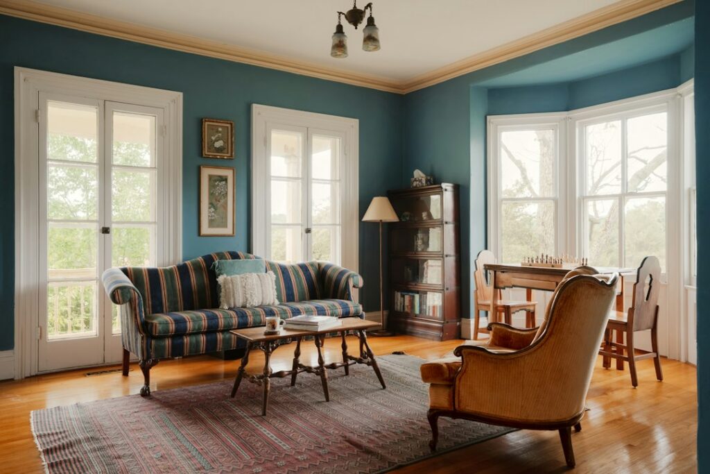
Blue-gray is another common choice for living areas. It can feel peaceful and established, but darker versions require adequate lighting. In a room with small windows, a deep blue-gray may appear much heavier than expected.
What paint colors work well in kitchens?
Kitchen colors are often selected to complement cabinets and countertops rather than stand alone. Soft white, creamy beige, pale gray-green, muted blue, and light taupe are frequently used because they support both traditional and contemporary finishes.
For kitchens with warm wood cabinets, a soft neutral or restrained green can provide balance. With white cabinets, blue-gray, muted green, charcoal, or warm beige may add definition without making the room feel busy.
Because kitchen surfaces reflect light, color should be checked at different times of day. A shade that looks neutral in the morning may appear yellow in the evening under warm bulbs. Grease, cooking residue, and frequent cleaning also make washable finishes useful on walls near work areas.
Which colors are commonly used in bedrooms?
Bedrooms usually favor quiet, low-intensity colors. Pale blue, soft green, warm white, dusty lavender, light taupe, and muted beige can create a restful atmosphere without making the room feel dull.
Very bright colors may feel energetic rather than calming, especially on all four walls. If a stronger color is appealing, using it on one wall or in a smaller area can provide interest while preserving a more settled overall appearance.
Dark bedroom colors can work well when the goal is a cozy, enveloping room. Deep navy, charcoal, forest green, and warm brown are most successful when balanced with lighter bedding, sufficient lamps, and contrasting trim. In rooms with limited daylight, these colors may make the space feel smaller.

What colors suit bathrooms?
Bathrooms often use light colors because they help the room feel clean and open. Soft white, pale gray, light blue, sage, beige, and sand are common choices.
Blue and green can be particularly effective in bathrooms because they suggest water and natural elements. However, very cool blue can make white fixtures look stark. A softened blue with gray or green undertones usually creates a more balanced result.
Bathrooms also have high humidity, so surface preparation and a moisture-resistant interior finish matter as much as color. Peeling or bubbling paint is often related to ventilation, condensation, or inadequate preparation rather than the color itself.
How does Dothan’s climate affect color selection?
In Dothan, warm weather, bright sunlight, humidity, and seasonal moisture can influence how paint looks and performs. Strong daylight can make pale colors appear brighter and can reveal undertones that are difficult to see indoors under artificial lighting.
Warm neutrals, soft greens, and muted blues often work comfortably with the region’s sunny conditions. Extremely intense colors may appear even more vivid on walls exposed to direct light. Exterior surfaces also experience heat, moisture, and ultraviolet exposure, so color selection should be considered alongside the condition of the surface and the type of coating being used.
Inside the home, humidity can affect drying time and may contribute to problems if a surface is painted before it is clean and fully dry. Kitchens, bathrooms, laundry areas, and rooms with limited airflow deserve extra attention during preparation.
How should paint samples be tested?
Paint samples should be viewed on the actual wall, not only on a small card. Apply large sample areas or use movable sample boards, then observe them in morning, afternoon, evening, and artificial light.
For a more reliable comparison:
- Test colors near trim, flooring, cabinets, and windows.
- Leave samples in place for at least a full day.
- Compare colors on both sunny and shaded walls.
- Avoid judging color while the sample is still wet.
- Look at the color from across the room, not only up close.
- Check whether nearby surfaces change the perceived undertone.
A color may appear lighter on a large wall than it does on a small card. Gloss level also affects appearance: higher sheen reflects more light, while flatter finishes tend to look softer but may show marks more easily.
Are popular colors always the best choice?
Popular colors are useful starting points, but they are not automatically right for every room. The best choice depends on natural light, room size, ceiling height, existing finishes, maintenance needs, and personal comfort.
A practical approach is to choose a flexible main color for connected spaces, then use more distinctive shades in bedrooms, offices, entry areas, or accent walls. This creates visual variety without making the home feel disjointed.
Color trends may change, but well-chosen paint should support the way a household uses the room. A slightly unusual color that looks good with the home’s lighting and materials will usually be more successful than a fashionable shade that conflicts with them.